Kaivohuone
Brand identity for
a nightclub and
a restaurant
Logo design
Custom typeface
Brand identity for
a nightclub and
a restaurant
Logo design
Custom typeface
2018
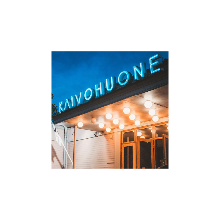
The sign was always the brand
Kaivohuone isn't just a nightclub. It's a piece of Helsinki's cultural memory. The iconic neon sign above the entrance, glowing in the Kaivopuisto Park’s night for nearly a century, isn't decoration. It’s a visual fingerprint that generations of people had already made their own.
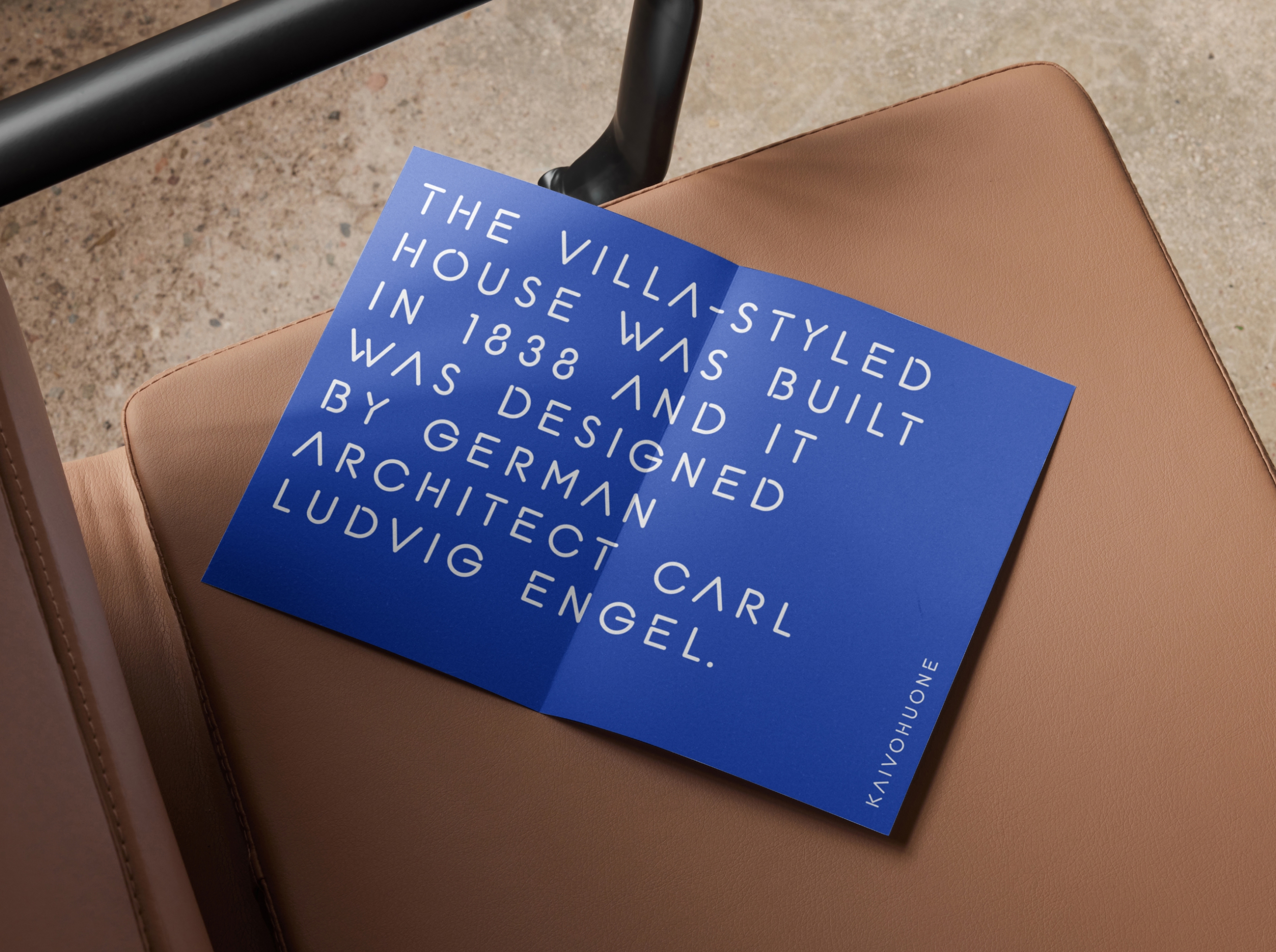
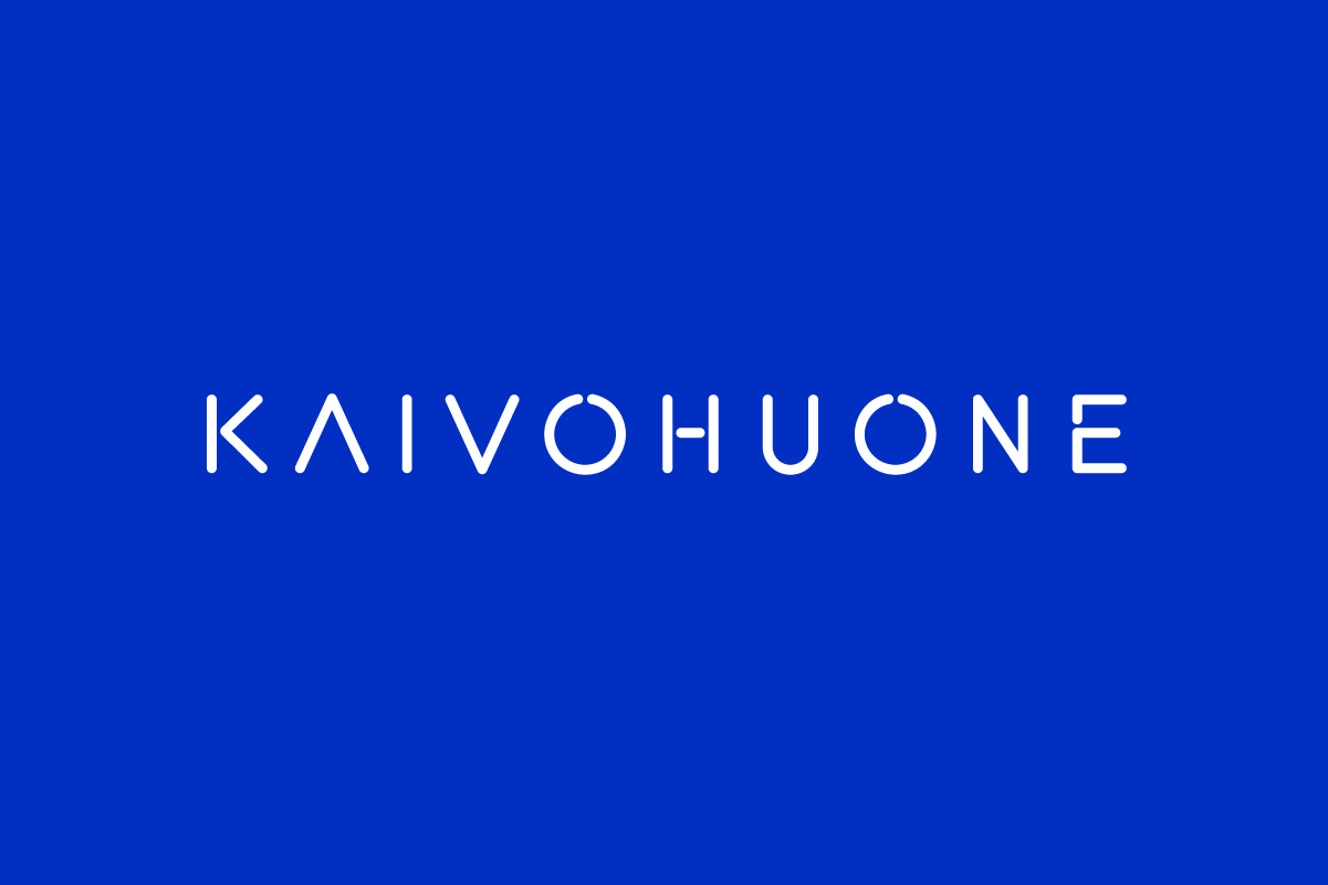
When Kaivohuone came to H23 Agency for a brand refresh, the answer wasn't to modernise away from that heritage. It was to build the entire identity from within it. We designed a custom typeface drawn directly from the distinctive letterforms of those neon lights: their geometry, their weight, their unapologetic presence. Every line and curve captured what makes the original sign feel timeless rather than dated.
The result was a wordmark and a typographic system that felt both completely fresh and instantly, unmistakably Kaivohuone. Applied across marketing materials, social media, events and the website, the typeface became the thread tying every touchpoint together. No one needed to be told what they were looking at.
That's what custom type design does at its best: it transforms something a brand already owns, a feeling, a memory, a shape burned into the city into a repeatable, scalable asset. History becomes a design system.