Kotopro
Brand identity
for a software company
and a product
Logo design
Brand colors
UI Design
Typography
UI icons
Brand identity
for a software company
and a product
Logo design
Brand colors
UI Design
Typography
UI icons
2021-2022
From software to tool
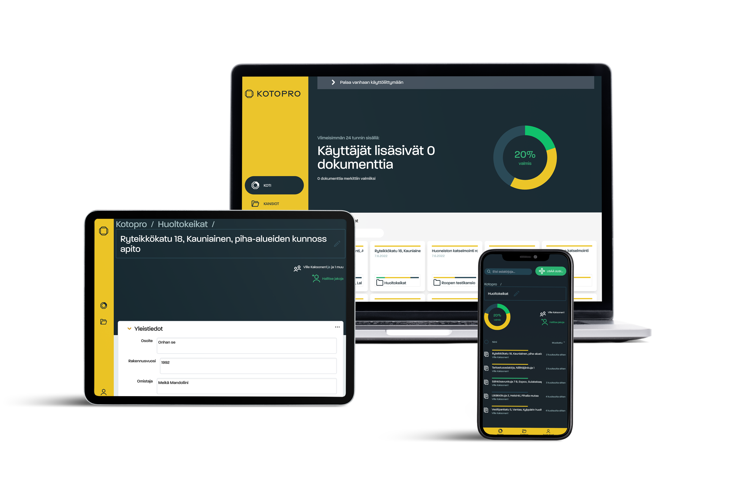
Kotopro came to us with a UI that had outgrown itself. The product had matured into a serious tool for construction-site documentation, but the visual identity still spoke the language of generic software. The refresh was about earning the trust of people who work with their hands.
The logo is an evolution, not a reinvention. The all-caps logotype KOTOPRO retains the geometric clarity of the original, while the brandmark was distilled into something more considered. A clean octagonal form with a square at its core. It carries a quiet nod to himmeli, the traditional Finnish hanging decoration that inspired the previous mark, but stripped back to its geometric essence. Simple, structural, purposeful. It also set the visual grammar for everything that followed.
That grammar mattered most in the icon set. For a SaaS product, the UI is the brand. Users spend hours inside the interface, and the icons are the visual vocabulary they navigate by. Every icon was designed in direct dialogue with the brandmark: the same geometric logic, the same weight, the same honest clarity. The result is a product that feels coherent from the first glance at the logo to the last tap in the app.
The new color palette, yellow, black, white and grey, completed the repositioning. These aren't software colors. They're the colors of construction, of high-visibility gear and heavy machinery. They signal that Kotopro belongs on a building site as much as on a laptop screen.
The response from users said it all. A brand refresh that also sharpened the interface isn't just cosmetic. It's functional. And when the two work together, the brand gets noticed.
Read the whole Kotopro case study on H23 Agency’s website ︎︎︎