Kauppias K.P. Ruuskasen säätiö
Visual identity for
a foundation
Logo
Colours
Typography
Illustrations
Visual identity for
a foundation
Logo
Colours
Typography
Illustrations
2023

Rooted for the future
Some organisations carry history as a weight. Others carry it as a foundation. For Kauppias K.P. Ruuskasen Säätiö, a foundation supporting business students and teachers, the heritage was never something to move away from. It was the starting point.
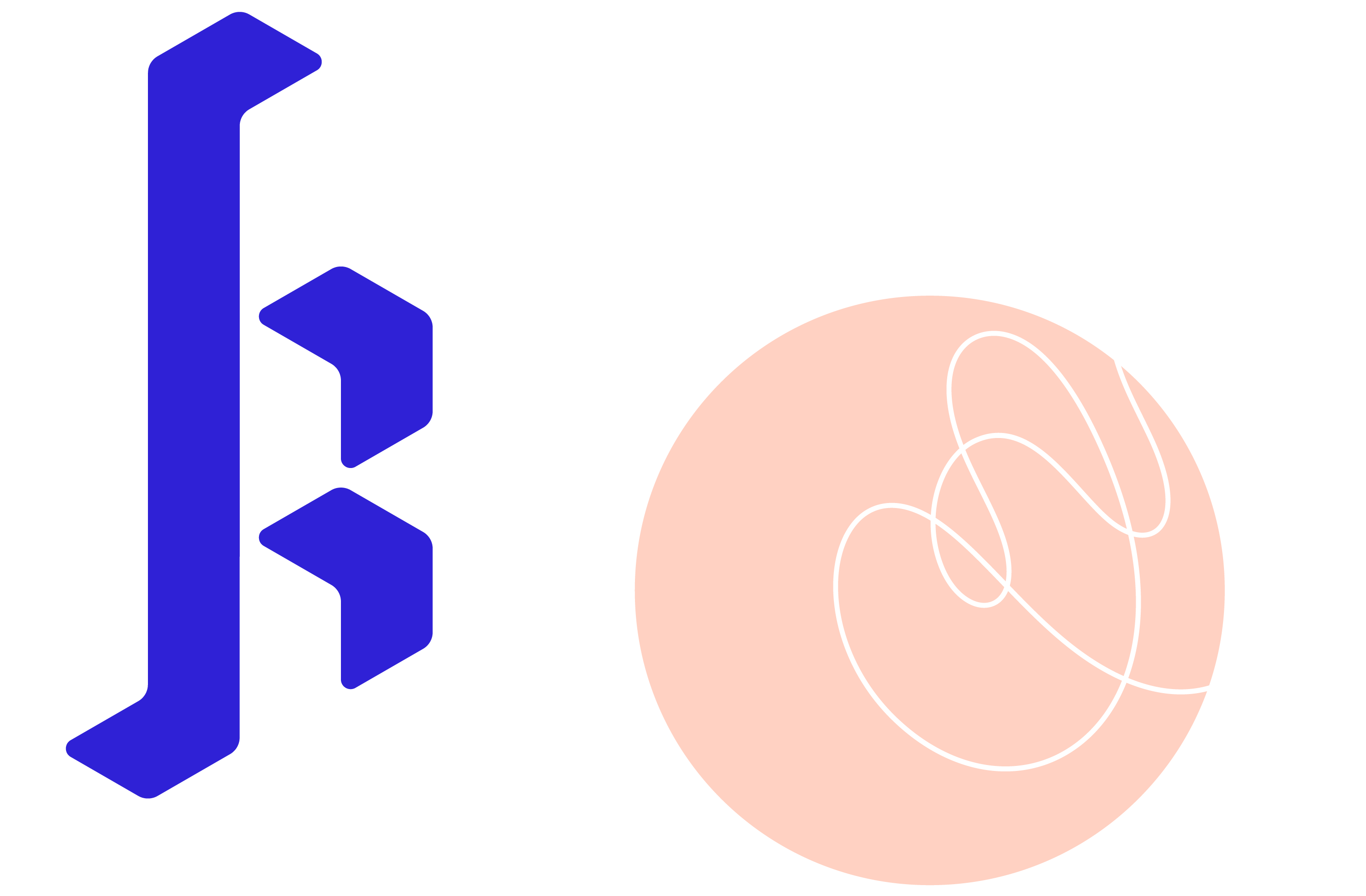
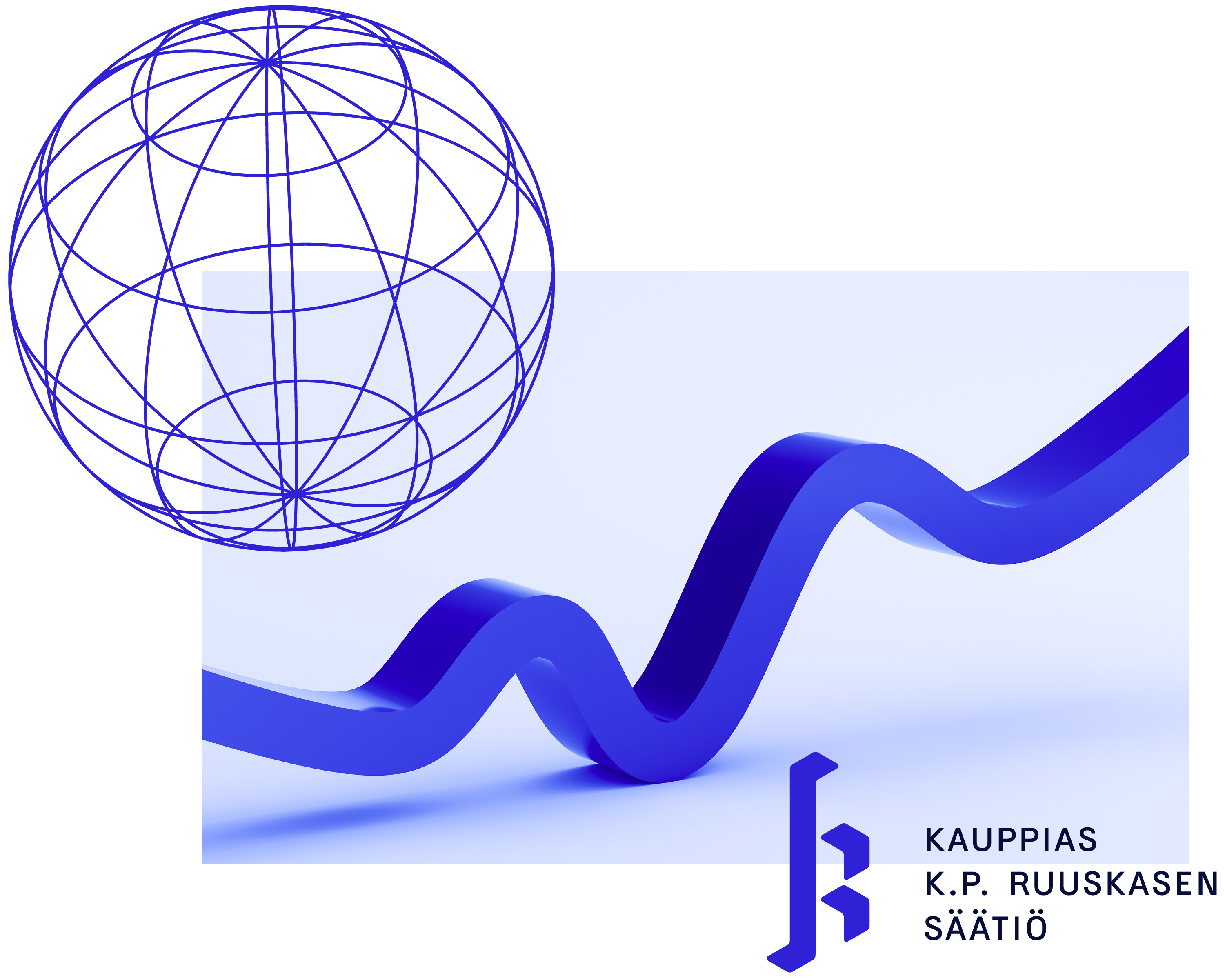
The identity centres on a lettermark K for Kaarle Ruuskanen. At first glance it reads as historic, the letterform echoing the rhythm of blackletter calligraphy, but it is built entirely from modern geometric shapes: a stem that rises like a business growth, and two upward pointing forms completing the letter. The same mark holds a century of tradition and a clear orientation toward the future. That tension is intentional.
The supporting illustrations extend this thinking in a different direction. Abstract, contemporary and deliberately vibrant, they bring energy and accessibility to the foundation's visual presence, connecting naturally with the students and educators they exist to support.
The result is an identity that respects where the foundation comes from without being defined by it. Rooted, but facing forward.