Optikko Heiniö
Brand identity for
an independent
optician’s boutique
Logo design
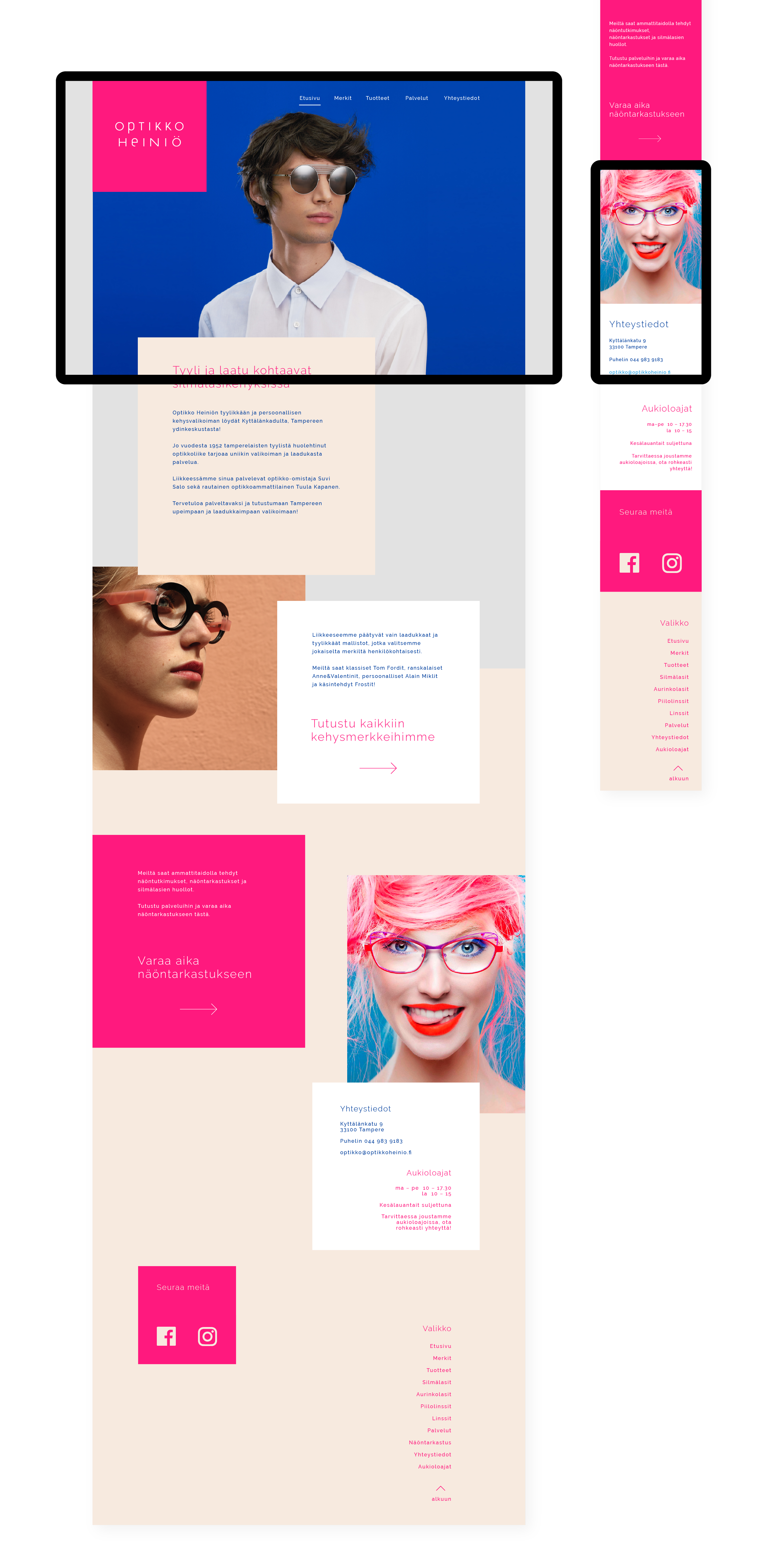
Web layout
Brand colors
Typography
Stationery
Brand identity for
an independent
optician’s boutique
Logo design
Web layout
Brand colors
Typography
Stationery
2017
When the frames are the art, the brand has to keep up
Optikko Heiniö has always been Tampere's destination for eyewear that makes a statement. An independent optician's boutique with a reputation for stocking designer frames that are visually striking, colorful and boldly individual. The kind of place you go when you want something genuinely special, not just functional.
When the new owner took over, the brand wasn't keeping pace with that promise. The existing identity didn't reflect the boutique's philosophy, and it certainly didn't match the caliber of the design objects they were putting in their customers' hands every day. They came to H23 Agency for a brand refresh that would close that gap.
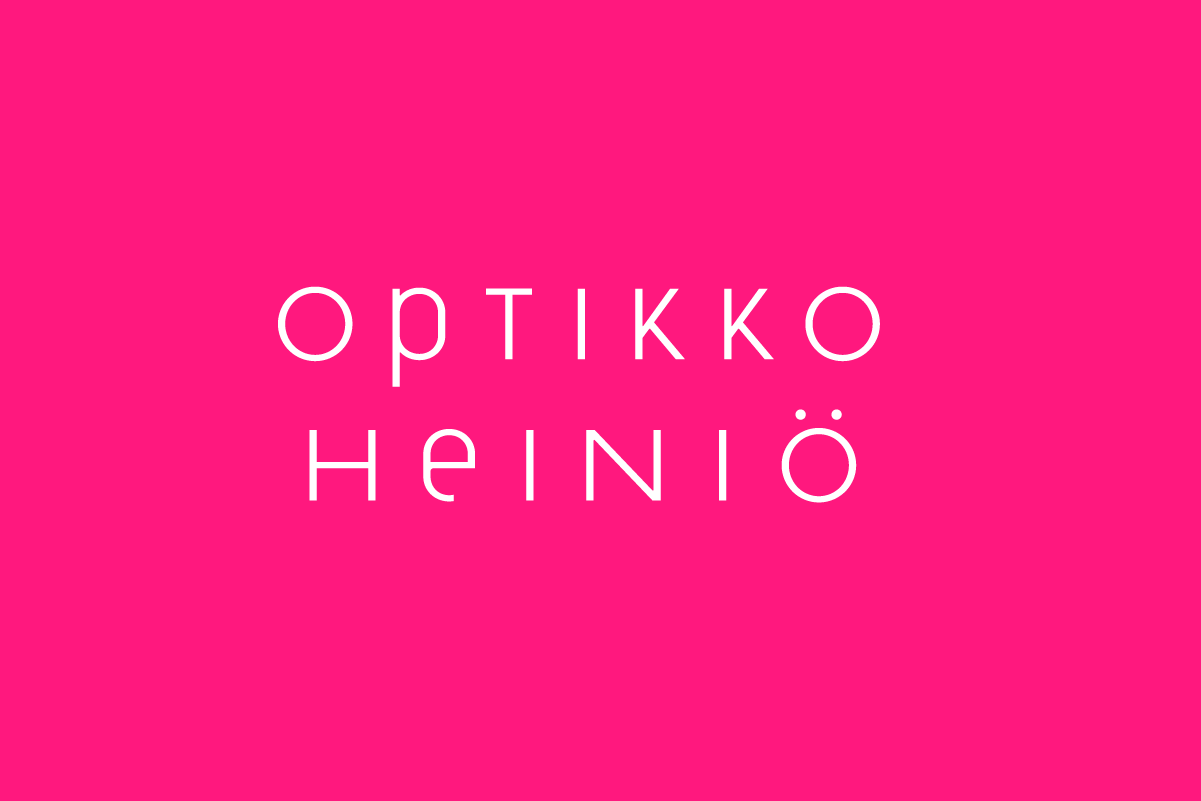
A wordmark that breaks the rules beautifully
The centerpiece of the new identity is a custom logotype. The wordmark mixes upper- and lowercase letterforms with geometric precision, combining narrow and wider characters in a way that conventional type design would advise against. But it works immediately, confidently and memorably.
Optikko Heiniö sits on two lines in its primary form, creating a stacked composition that feels both boutique and authoritative. It also functions effortlessly as a single-line lockup, giving the brand flexibility across every application. The result is a wordmark that reads as quirky and considered at once. The typographic equivalent of a frame that stops you mid-browse.
Color as a Brand Statement
For the primary brand color, we chose a vibrant, unapologetic pink. A pink with the same shock value as the wildest frames in the boutique's collection. It signals immediately that this is not a generic optical chain. This is somewhere with a point of view.
The broader palette brings in white for clarity and cleaner applications, alongside earthier tones that temper the intensity of the pink without diluting it. The result is a color system that can swing between bold campaign moments and refined, understated elegance depending on the context.
For printed materials that customers take home and keep we specified gold foil on high-quality print stock. Because when someone has just invested in a pair of frames they love, the bag, the card and the case they carry them in should feel worthy of that choice. Tactile quality communicates brand values in ways that digital touchpoints simply cannot.
This is what a logo designer for a luxury boutique should deliver: not a safe, predictable identity, but one that captures the genuine character of the business and elevates it. Custom logotype design for a boutique brand is one of the most powerful investments an independent retailer can make, particularly in a market where they are competing against well-funded optical chains with generic, forgettable branding.
Optikko Heiniö now has an identity as distinctive as the eyewear they sell. Every touchpoint from the window display to the carrier bag to the website communicates the same thing: this is the place to come if you want something that no one else has.