Pirkanmaan paahtimo
Brand identity for
a coffee roastery
Logo design
Illustrations
Packages
Icons
Brand identity for
a coffee roastery
Logo design
Illustrations
Packages
Icons
2017-2026

Some brands you design. Some brands you grow into
Pirkanmaan paahtimo has been part of my work since 2017. Long enough to see the brand mature, evolve and find its confidence. What started as a packaging design project has become something closer to a shared language between a roastery and its customers.
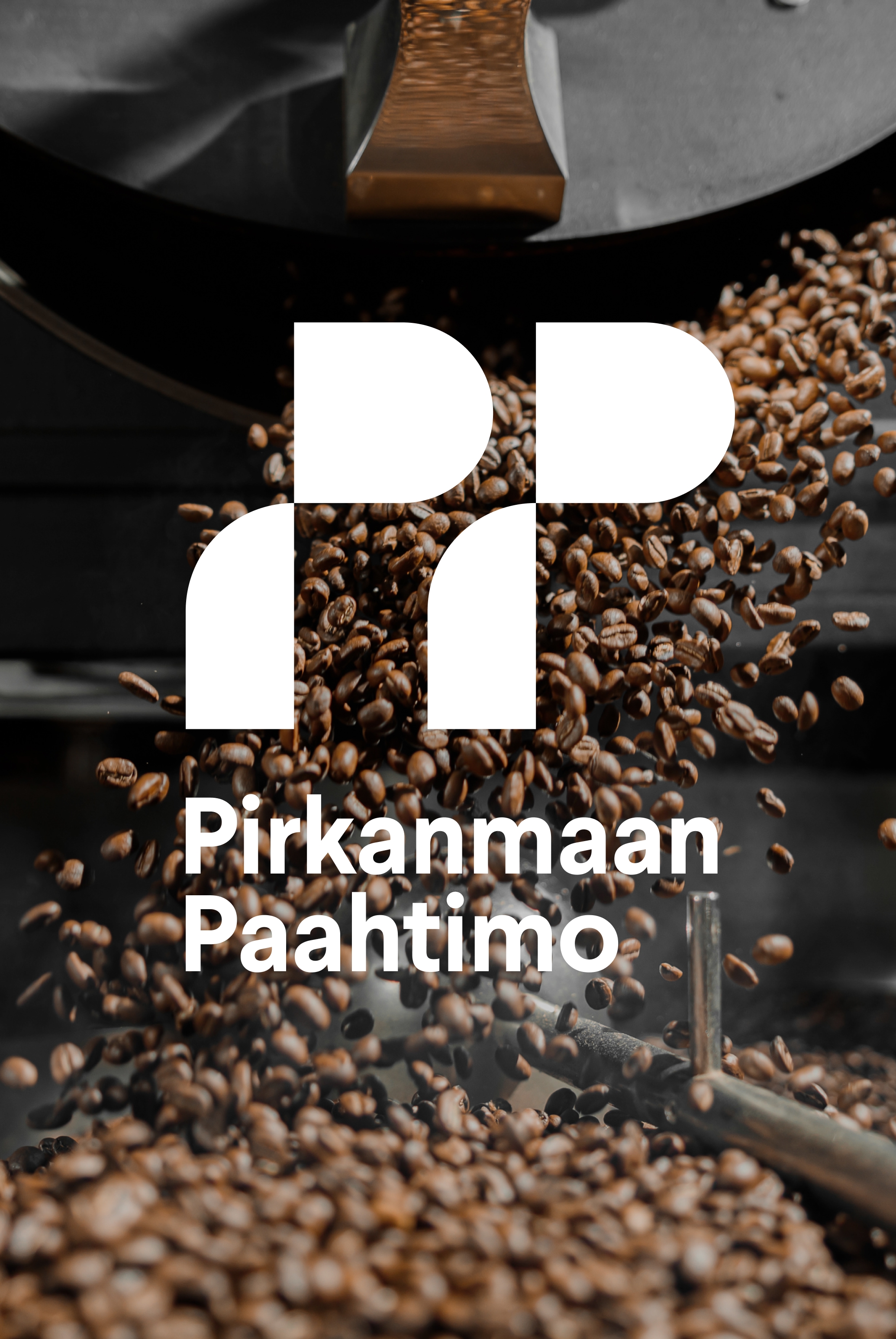
The heart of the identity is the brandmark: two geometric, abstract letter P's, a shape that rewards a second look. A lettermark, yes. But also two coffee cups mid-pour, or a pair of coffee scoops standing at rest. A mark that can be read multiple ways is a mark people keep looking at, and a mark that holds up for decades.
Timelessness in logo design doesn't come from playing it safe. It comes from reducing an idea to its most essential form, and trusting that form to carry meaning without explanation.
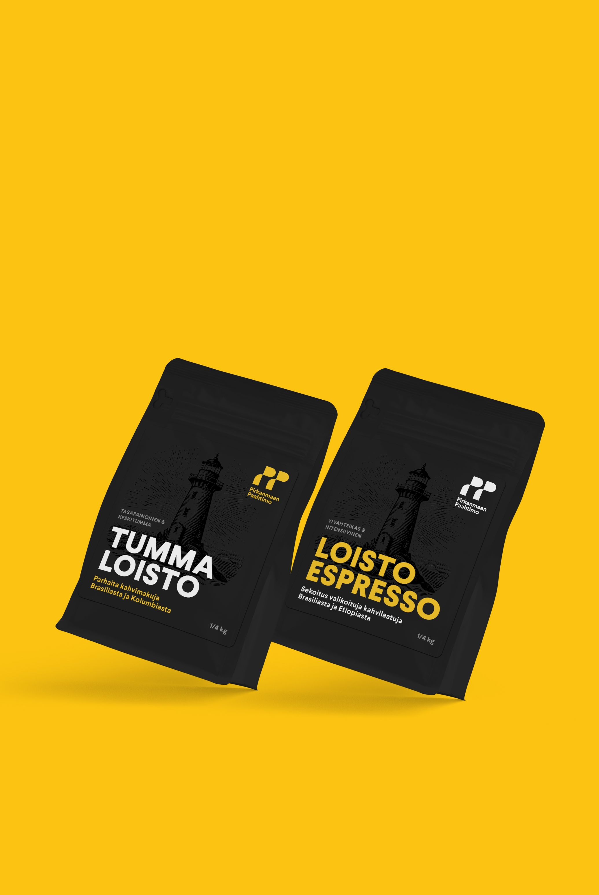
The packaging extends that confidence into typography. Rather than reaching for the expected coffee-brand warmth, I chose typefaces that feel subtly, deliberately off. They bring a clean, contemporary edge that sets the products apart on shelf. Not cold, but considered. The slight tension between familiarity and unexpectedness is exactly what makes the visual language memorable.
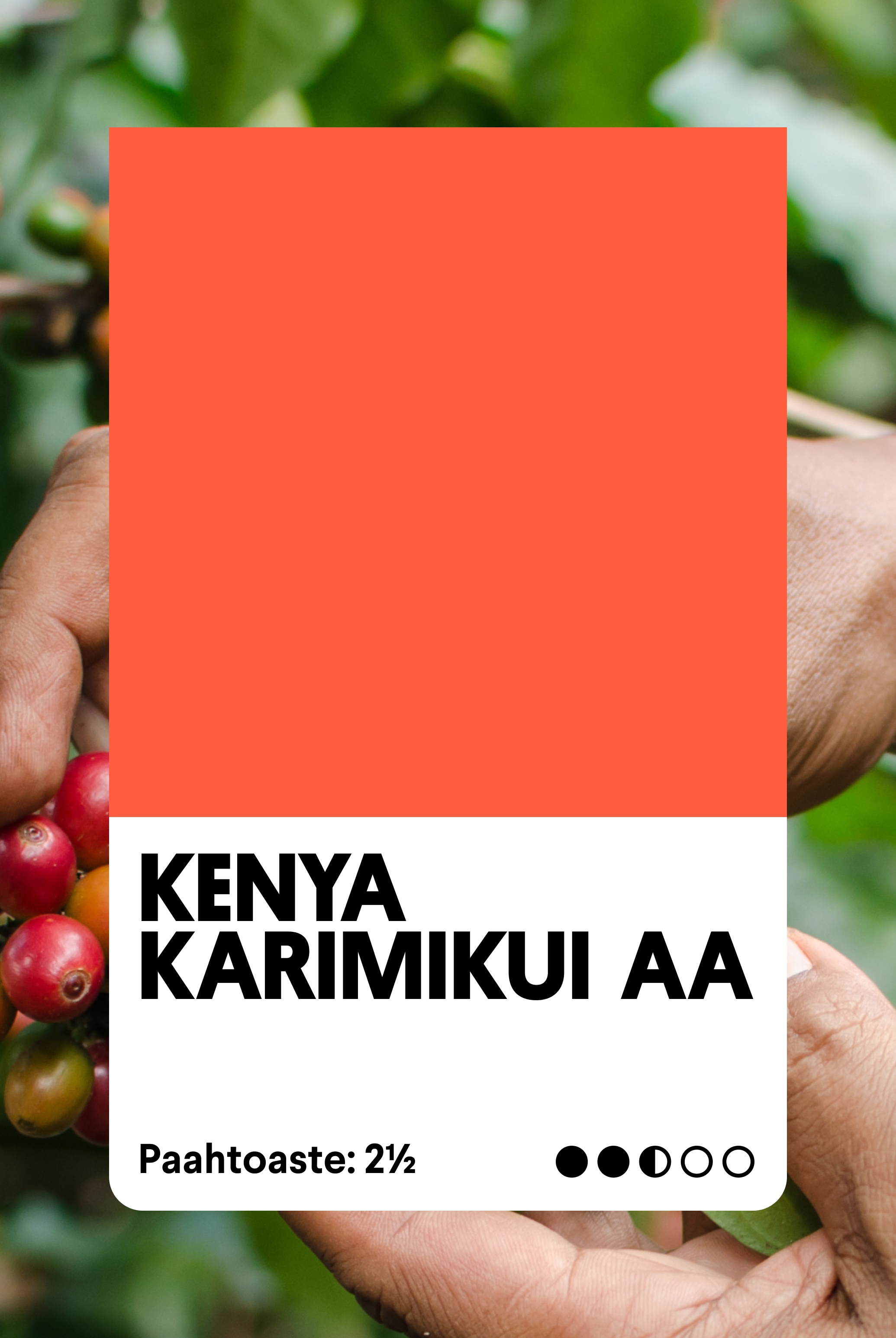
Color does the rest. Strong, unapologetic palettes that don't ask permission to be noticed. In a category where packaging often tends toward earthy neutrals and craft-paper nostalgia, Pirkanmaan Paahtimo stands out by committing fully to its own visual identity.
The copywriting completes the picture. Slogans like Lämmöllä paahdettu (roasted with warmth) carry a dry wit that earns a smile. That kind of double meaning reflects a brand that knows exactly who it is and isn't afraid to be a little clever about it.
This is what a brand looks like when all the parts are pulling in the same direction: a mark with staying power, typography with personality, packaging with presence, and a voice with a wink in it.
In 2025, their packaging was recognised as the best coffee packaging in Finland. When the strategy is sound and the execution is uncompromising, the work tends to speak for itself.