Ruthin leipomo
Brand identity
for a bakery
Logo design
illustrations
typography
packaging design
Brand identity
for a bakery
Logo design
illustrations
typography
packaging design
2021-2026
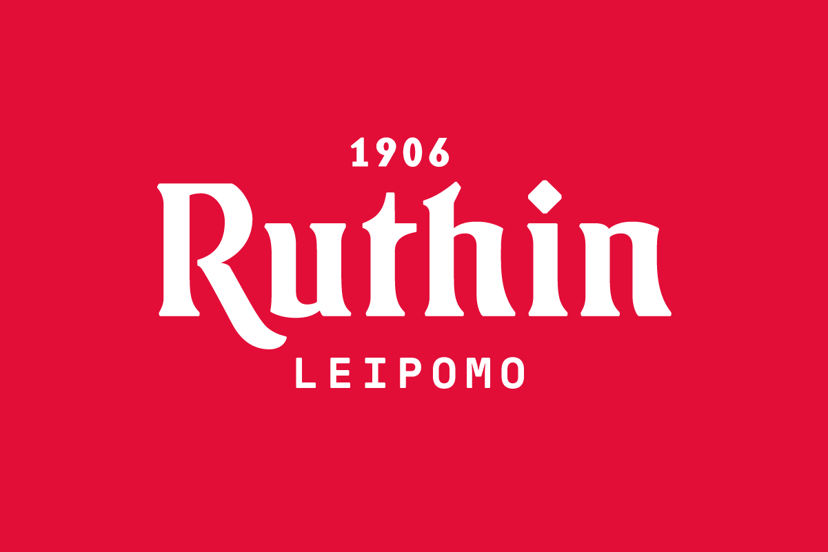
Since 1906. Drawn for what's next.
A bakery founded in 1906 has something most brands spend years trying to earn: genuine history. The challenge was never to invent a story for Ruthin Leipomo. It was to give that story a visual form confident enough to travel beyond Jyväskylä region and speak to the whole of Finland.
The wordmark draws from the calligraphic tradition of Nordic Art Nouveau, redrawn with a contemporary hand. The letterforms carry the weight and craft of that era, but drawn with enough restraint and contemporary sensibility that the mark feels alive today, not preserved. 1906 and 21st century coexist in the same letterform.
That balance matters for a brand like Ruthin. Their loyal regional customers recognise the heritage. New customers across Finland see a brand with character, quality and confidence. The wordmark does not need to explain either. It simply looks like it has always been here, and intends to stay.
Honest bread deserves an honest mark. One that was made, not assembled.