Zoneatlas
Visual identity for
an interactive map
solutions developer
Logo
Illustrations
Colours
Typography
Icons
Visual identity for
an interactive map
solutions developer
Logo
Illustrations
Colours
Typography
Icons
2019 - 2026

Brand Identity for an Interactive Map Provider
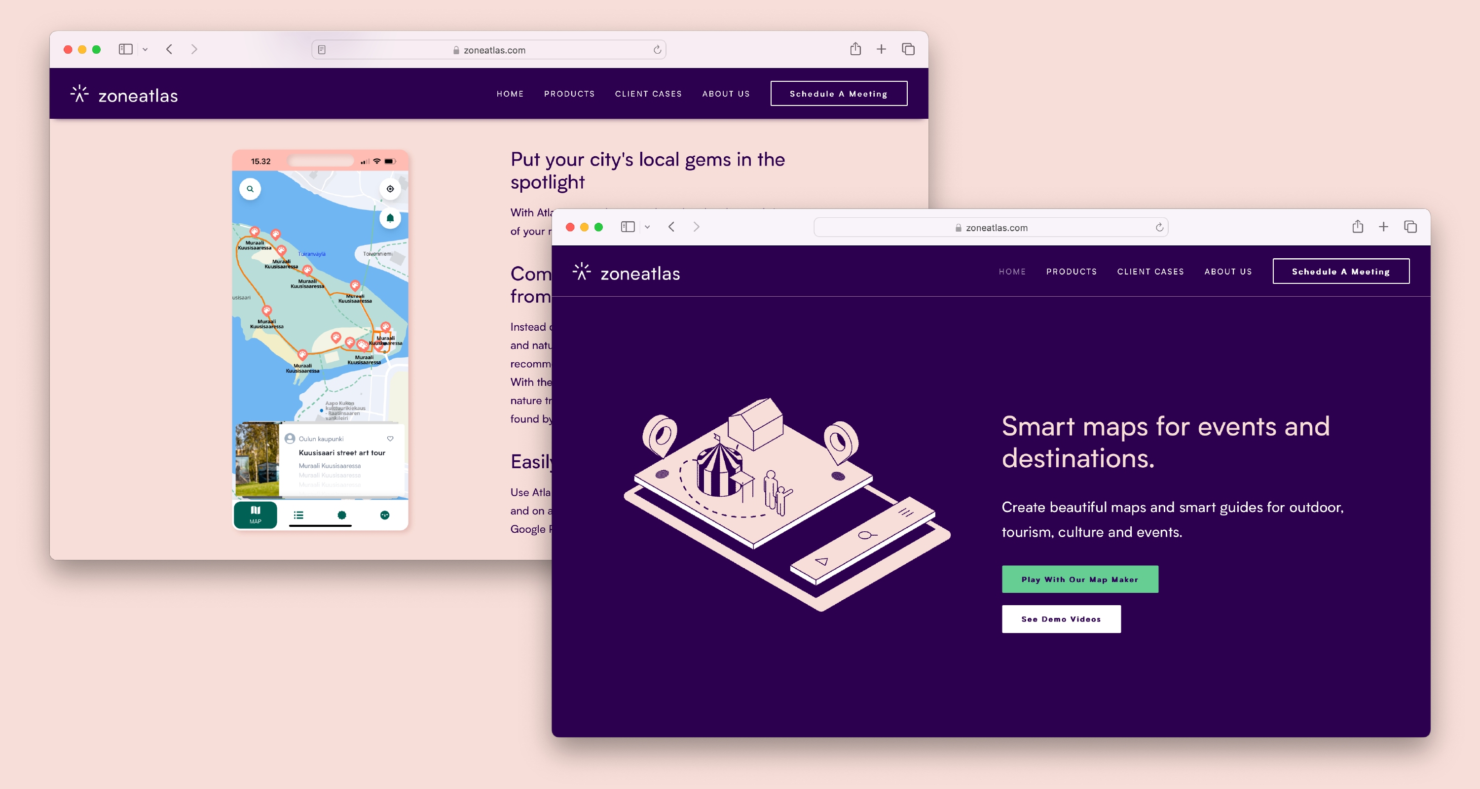
Zoneatlas didn't just get a new name, they got a new identity in every sense. Previously operating as Tietotemput, a general IT services company, they made a deliberate strategic decision to leave the broad IT market behind and reposition as specialists in location services and digital map solutions. A name change alone wouldn't be enough. The visual identity had to signal that shift clearly and credibly to their market.
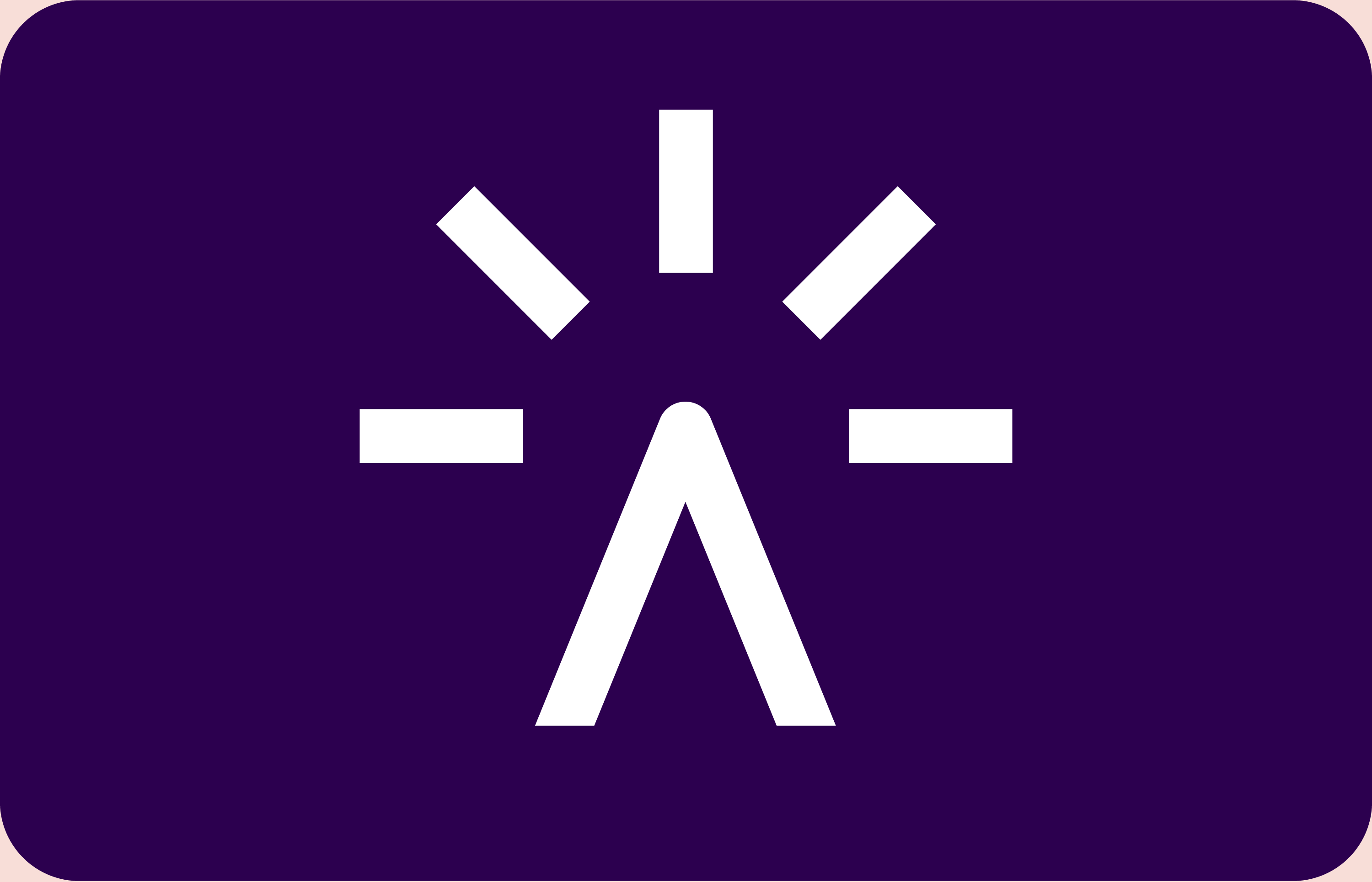
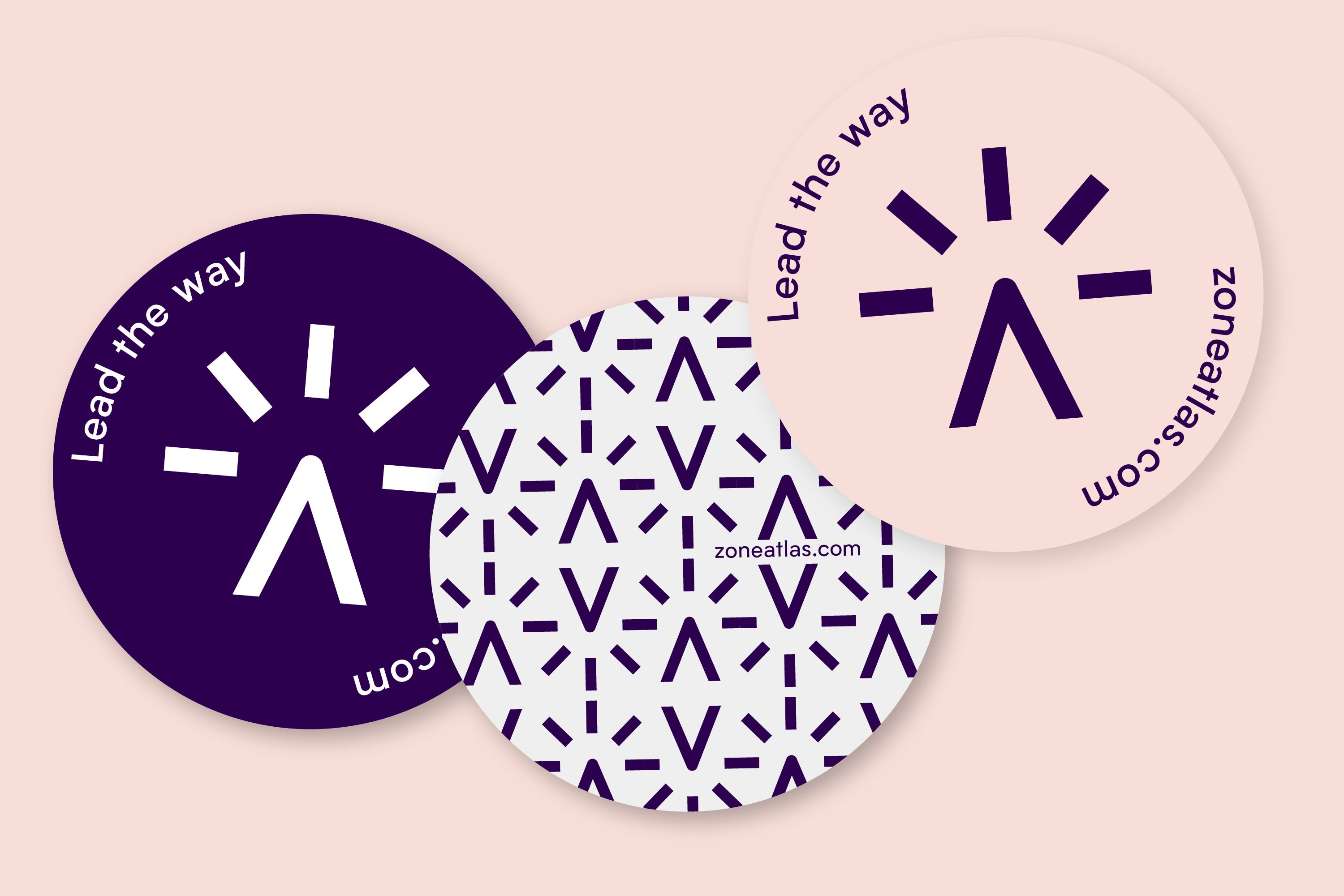
The logo became the anchor of that repositioning. A single mark that carries three readings simultaneously: a mountain peak which is a timeless symbol of orientation and wayfinding, a lighthouse, guiding people through unfamiliar waters, and a cursor clicking on a map, placing Zoneatlas unmistakably in the digital space. The ambiguity is intentional. It speaks to both the physical intuition of navigation and the digital precision of their product.
Beyond the logo, the visual system needed to hold up across complex product interfaces. A comprehensive icon set was designed for use across their UIs and as point of interest markers within their maps built for consistency, legibility at small sizes and clarity under real usage conditions. A series of illustrations extends the brand into richer communication contexts, giving Zoneatlas a visual language that works from product interface to marketing material.
The result is a brand identity that does what good strategic design should: it makes a business decision visible. Zoneatlas is no longer a generalist, now they look specialists in their area of expertise.